London property prices
Visualising the evolution of the residential market
(1995 to 2013)
The London residential property market has always been strong. However, it is only in the last twenty years or so that property prices have increased to such levels that previously "cheap" areas have now turned into prime locations. The gentrification process, together to an increase in population, have pushed up the prices even in peripheral areas. The purpose of this exercise is to visualise these changes, covering the period 1995-2013.
In the next section, I present the graphical results of the analysis and provide some commentary. I present the methodology, the data and the tools I have used in the last section, where I also provide links to download the code and the data.
Each section can also be accessed directly using the navigation links at the top of the page.
Analysis
I have focused on two aspects of the London residential property market: average local prices and the frequency of transactions in each neighbourhood.
As unit of analysis I have used the electoral ward. A ward is a sufficiently small unit to be relatively homogenous in terms of the characteristics of the housing stock as well as demographics. However, it is also large enough for meaningful information to be available in each period.
Prices
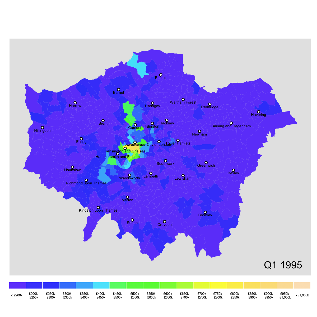
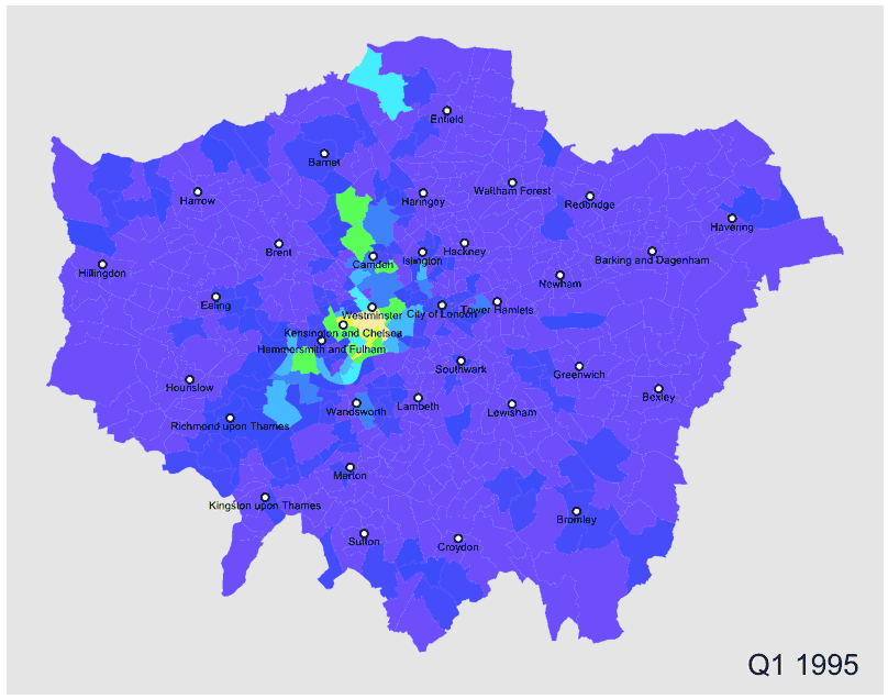
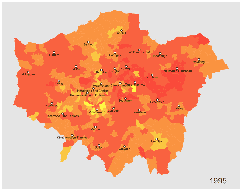
1995
The map shows average property prices in each ward at the beginning of the analysis period (Q1 1995). We can clearly see some property hotspots. However, these are few and concentrated in the central boroughs of Westminster and Kensington & Chelsea, as well as Camden (Hampstead and Belsize Park) in the north. The average prices in the rest of the city appear to be uniform and (relatively) low.
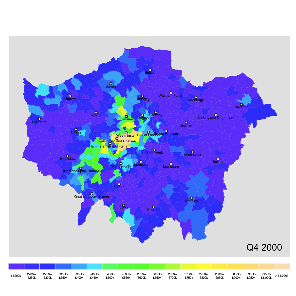
2000
By the end of the millennium, the situation has already changed significantly. While the central areas continue to be very expensive, new areas to the north and to the south-west (e.g Hammersmith, but also Richmond) have become significantly more expensive.
The prices in the east of the city are still close to their 1995 level, though the prices in some areas such as Tower Hamlets, are beginning to increase. We can also observe a similar phenomenon at both the south-eastern and north-western outskirts of the metropolitan area.
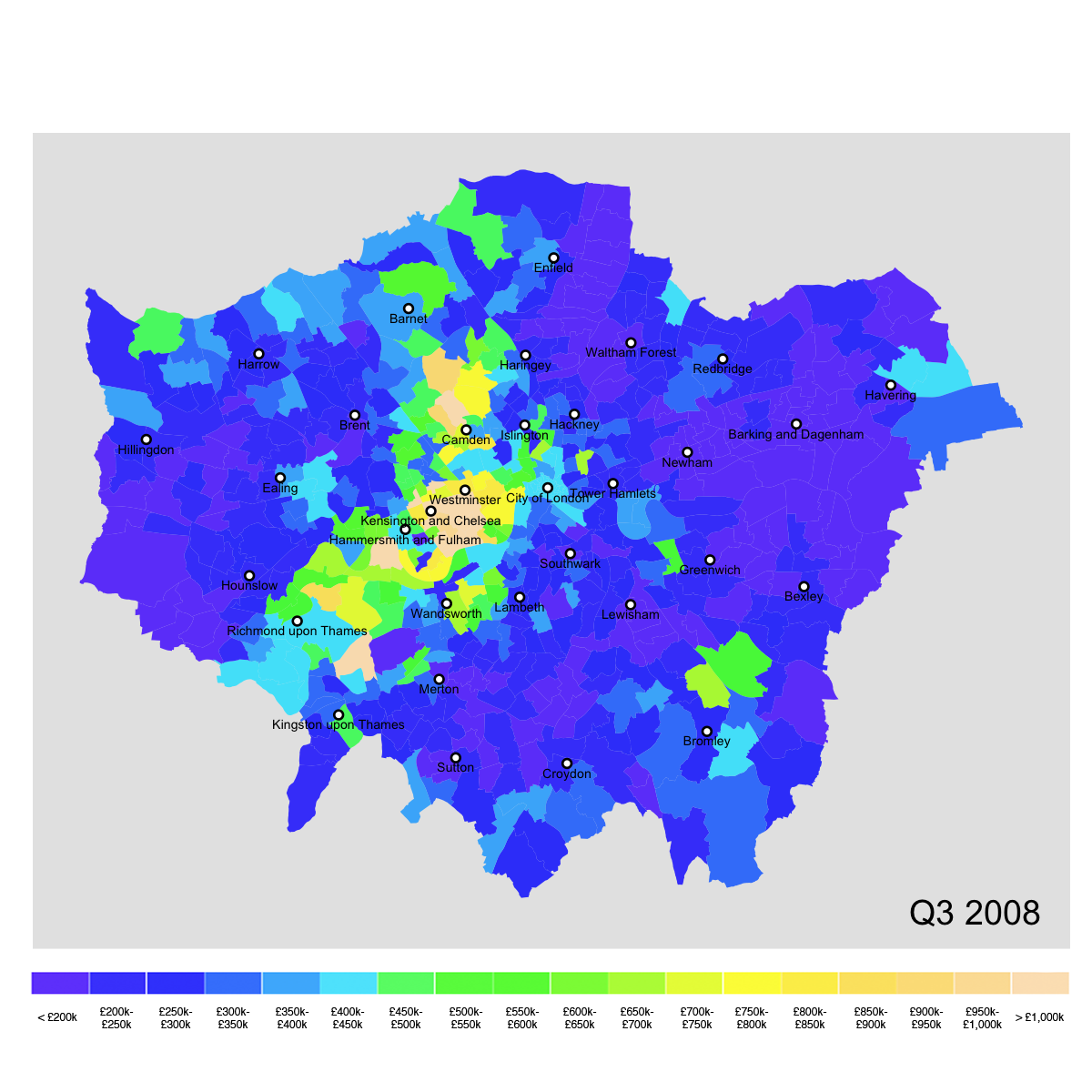
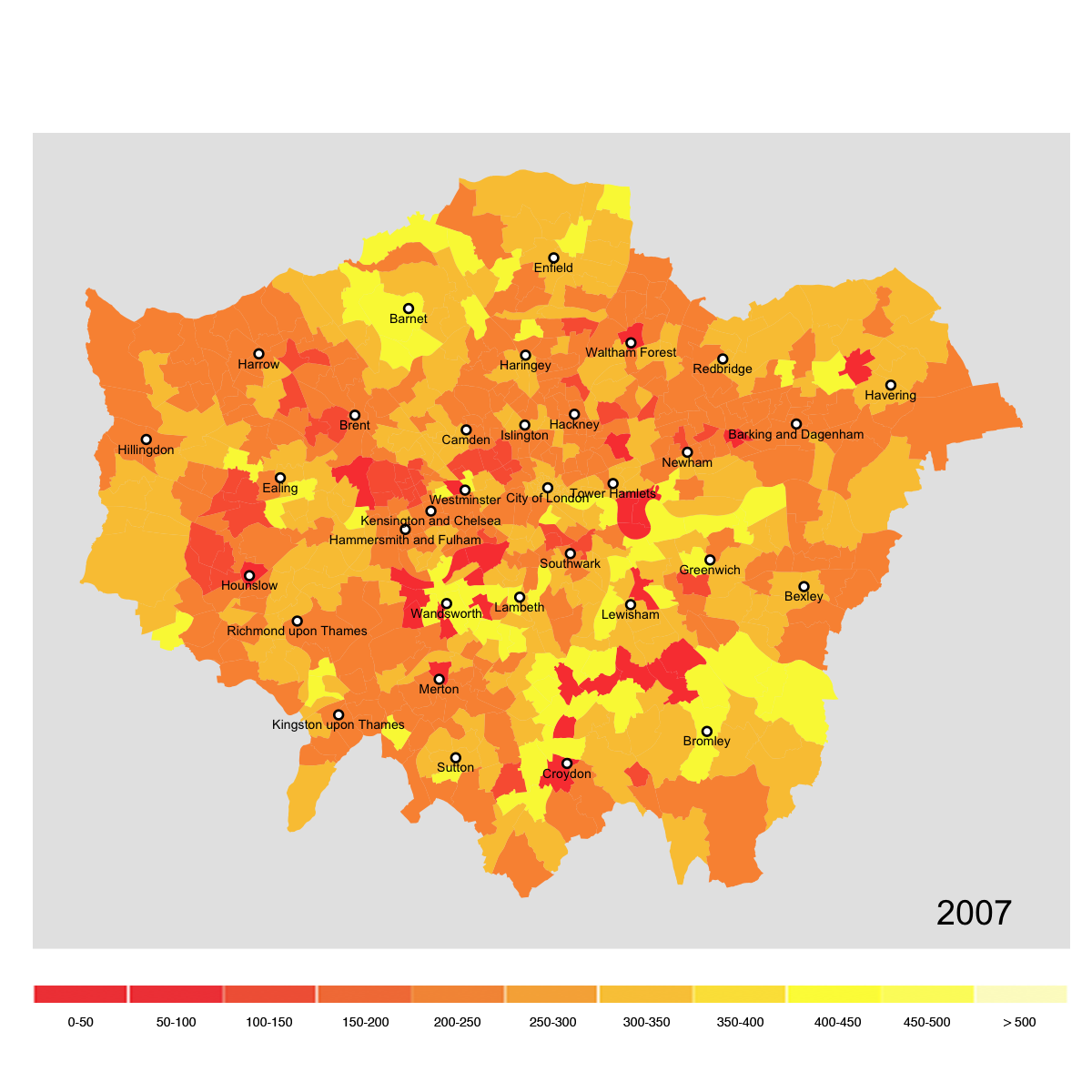
Pre-financial crisis
On the eve of the financial crisis, the growth areas identified above have become even more expensive. The map shows that there are now some areas outside central London where the average property price is close to £1m.
We can also observe an increase in average prices in the Docklands area (Tower Hamlets) which has undergone redevelopment and growth during the late 90s and early 2000s.
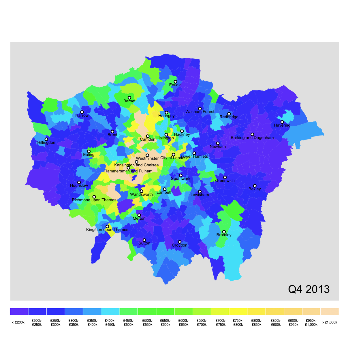
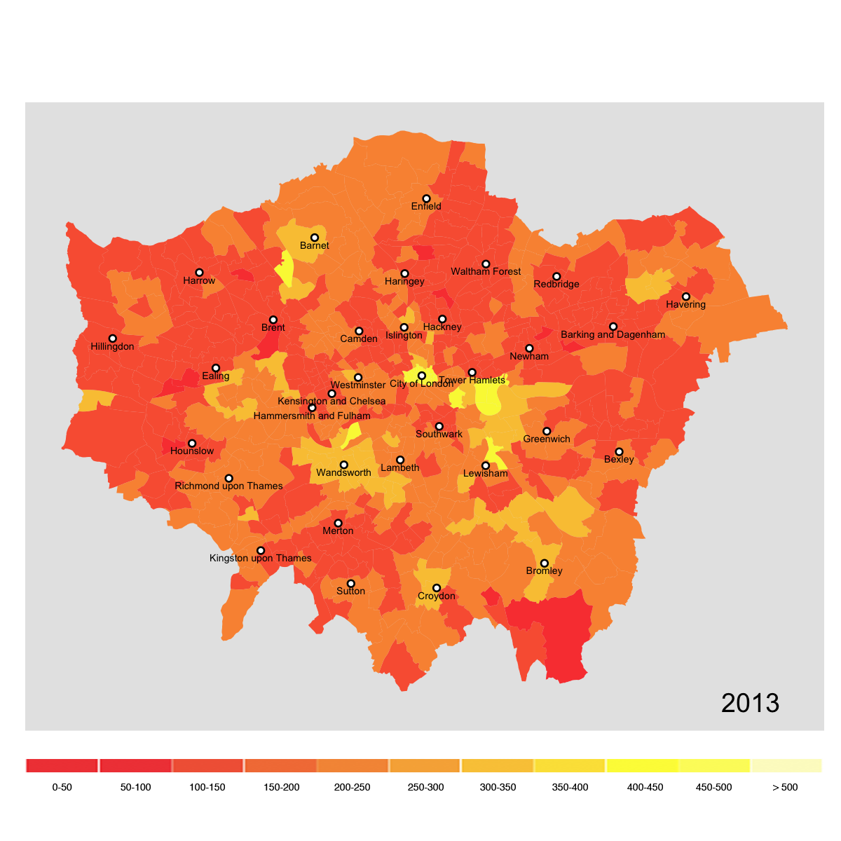
2013
We can see that, by the end of the analysis period, the financial crises does not seem to have dented the growth in residential property prices. Growth in the core area has continued and has expanded to previously less expensive neighbouring areas.
Price growth has also continued in the east (possibly helped by the London Olympic Games in 2012) as well as in the south-east and the north-west.
The map shows that by the end of 2013 there were only pockets of "cheap" areas. A sharp contrast with the situation in 1995.
Price evolution
The animation shows the evolution of local average prices by quarter for the whole period 1995-2013. It shows the development of prices as discussed above.
Frequency of transactions
Before the crisis
The chart shows the total number of transactions in 2007 in each electoral ward.
The London residential market is known to be very lively, with several buyers and sellers at any given time. For example, the chart here shows that, in 2007, many transactions took place across the whole city and only a few local areas experienced a relatively sluggish market. The market was helped by the practice of easily offering mortgages to residential buyers (even riskier ones), which many banks followed.
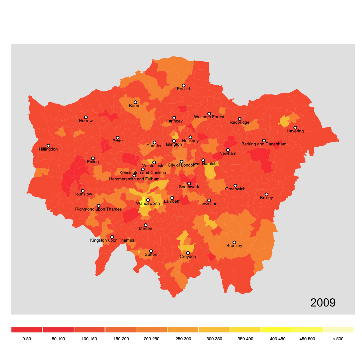
The "credit crunch"
The financial crisis affected the entirety of the banking sector in the UK. Most banks had to be bailed out by the government. These banks, as well as those that were not rescued but survived, became strongly risk-averse. This translated into a restriction on credit - known as the "credit crunch" - which suddenly made mortgages very hard to come by. As a result, the number of property transactions dropped, as shown in the chart.
Interestingly, property prices were not affected significantly by the crisis. This supports the view that the property prices in London are driven by supply constraints. These are due to the fact that most of London is already built-up and the city is surrounded by a "green belt" where new developments are restricted.
Back to normal?
The chart shows that in 2013 the number of annual transactions has not yet gone back to the levels of 2007. By this time, the crisis was inching towards its conclusion, but for most buyers it was still relatively difficult to obtain a mortgage.
Market dynamics
The animation below shows the evolution of the number of transactions in each year of the period 1995-2013. The impact of the "credit crunch" in 2008 and 2009 is obvious.
Methodology
Approach
I have followed these steps. I have carried out most of the analysis in R and used Photoshop to generate the animated charts.
- First I aggregated the data, which was provided in four separate files, into a single dataset. Then I trimmed the dataset by keeping only the most relevant columns, namely the date of the transaction, the price paid and the geographic information (location) for each transaction.
- I converted all prices, which were provided in nominal terms, to a common price base (2013) using the UK inflation index. This made the prices directly comparable across periods.
- Using the dplyr package, I summarised the data by calculating average prices by ward and quarter, as well as the total number of transactions by ward for each year.
- Turning to the geographic data, I subset the full data set, which is provided for the UK as a whole, to extract the information for Greater London. During this phase I have also corrected the data to fix any inconsistency with the transaction dataset and ensure a correct matching of the information. Most of the corrections regarded the spelling of place names (an example is St. George's vs. St George's).
- Finally, I matched the price data with the geographic data. Then I generating the charts for each of the periods considered using ggplot2 and created the animations (GIFs) using Photoshop.
Data
I have used three main sources of data:
- The "price paid" dataset provided by the UK Land Registry. The dataset contains a record for every single property sale. I have used data covering the period from January 1st 1995 to December 31st 2013. The full dataset I have used contained about 2.5m records, that is all the transactions that took place in Greater London during the analysis period.
- Detailed geographic "shapefile" data to draw the maps in R. The data are provided by the UK Office for National Statistics and can be downloaded from their Open Geography portal.
- Quarterly inflation data (RPI) from the UK Office of National Statistics.
Downloads
- The R code.
- An example of the property transactions data. The full dataset can be downloaded from Dropbox here.
- The geographic data. The required files are those with extensions .dbf, .shp, .shx. (note, this is a direct link to a 57MB download).
- The inflation price index data
Instructions: the analysis can be reproduced by running the R code provided. The working directory of the R file should also contain the following:
- a sub-directory called 'house_prices' containing the property transactions data (four .csv files)
- the geographic data and the inflation data
- two subfolders called 'charts/price' and 'charts/freq' to store the charts created
Execution time is about 10-15 minutes on a relatively recent computer.
Last updated: 20.04.2015