Airlines' Tweets
A Topic Modelling Analysis
Stefano Costantini
 Introduction
I fly quite a bit between London and Barcelona. When choosing my flights, I have several airlines at my disposal. Admittedly, they're all quite similar, in that they are all economy-class only, hand-luggage heavy, no-frills kind of airlines. Despite this, I do perceive some difference between them. I was interested in finding out whether these differences in perception were shared by the wider travelling public. So I downloaded a bunch of tweets written during the month of December 2015 that mentioned five of the major airlines connecting London and Barcelona. Eventually, I got a dataset of about 29,000 tweets. I analysed these tweets by fitting a Latent Dirichlet Allocation (LDA) model. I had three objectives:
- Identify some of the key topics that passengers discussed in their tweets,
- Determine the "sentiment" of each topic, i.e. determine whether it expressed a positive or a negative feeling.
- For each airline, identify the topics that its passengers discussed the most (and, based on the "sentiment" of each topic, observe whether its passengers had a positive or negative feeling towards it).
Topics
After cleaning the data a bit (remove stopwords, acronynims such as RT, @-replies, etc.) I fit a 50-topic LDA model to the corpus of tweets. Each topic is a probability distribution over the dimensional space defined by all the words in the corpus. What differentiate one topic from another is the probability given to specific words.
As they are probability distributions, topics do not come with "human-readable" labels. However, if you're lucky, some of them lend themselves to some kind of interpretations. Out of the original 50 topics, I selected ten which seemed amenable to being given a label. Specifically, I identified:
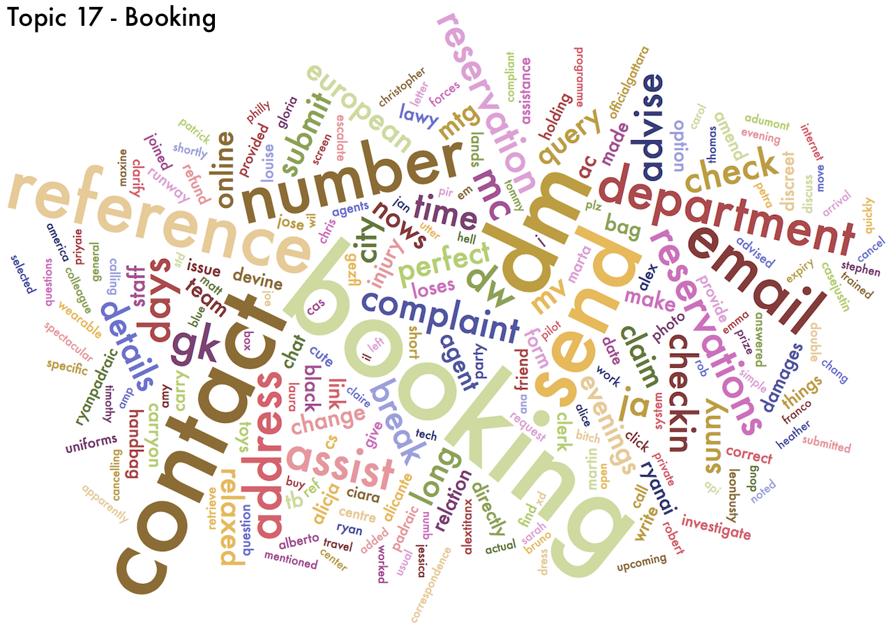
- One topic about "booking" flights (Topic 17)
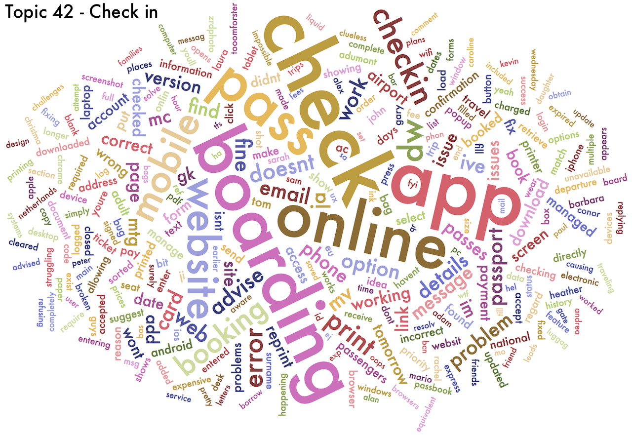
- One topic about "check-in" and boarding (Topic 42)
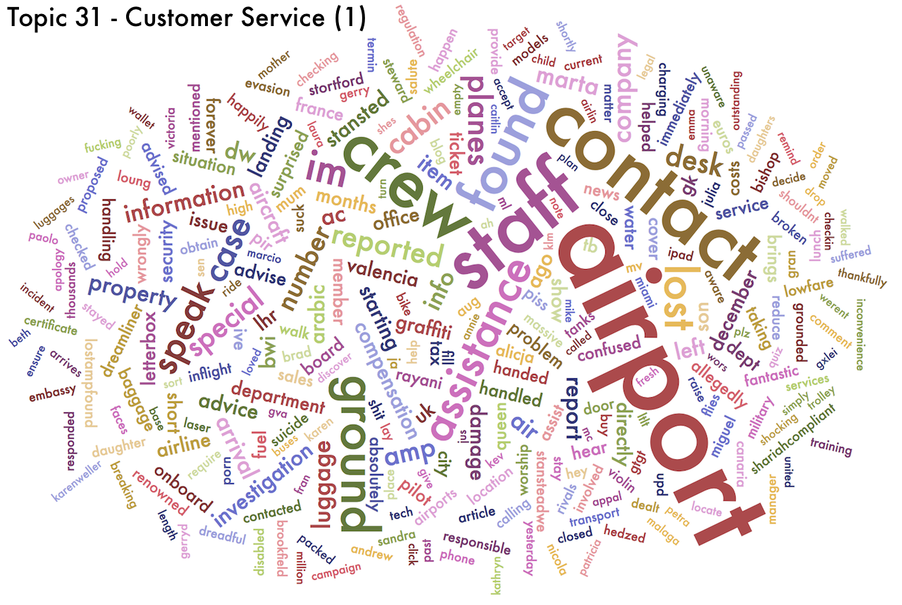
- Two topics about "customer service" (Topics 31 and 49)
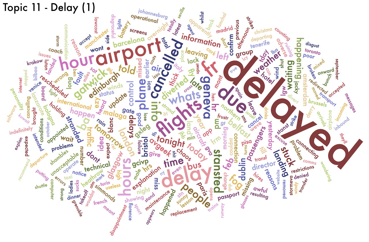
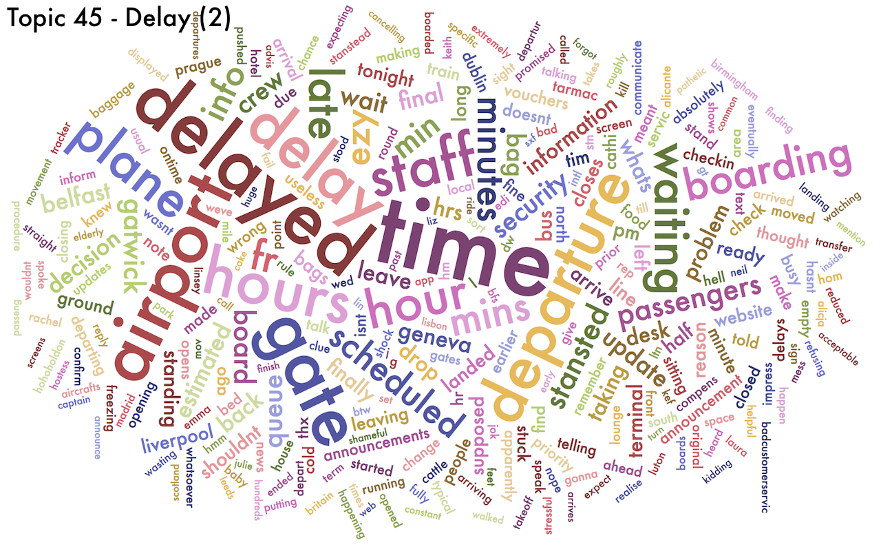
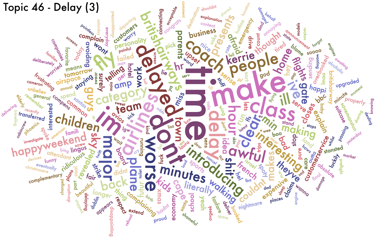
- Three topics about delay (Topics 11, 45 and 46)
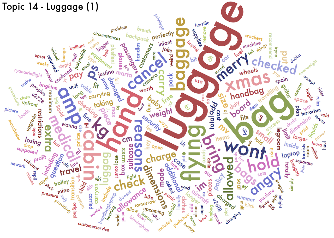
- Two topics about "luggage" (Topics 14 and 27)
- One topic about "seating" (Topic 37)
Because they are probability distributions, topics can be represented as word clouds, in which the size of each word is proportional to the probability given to that word. If a word (or words) are given probabilities much higher than other words, we could simplify and say that that topic is "about those words". Below are the wordclouds for the ten topics I chose. You can click on each of them to enlarge it and explore it in detail.


Sentiments
Next, I tried to give a connotation (i.e. a positive or negative "sentiment") to each of the topics. Sentiment scoring of a document can be done by counting the number of occurences of words that belong to a "positive" or "negative" dictionary.
To apply this approach to topics, I converted each into a vector repeating each word proportionally to their given probability within that topic. Thus, a topic giving a probability of 20% to the word, say, "complaint" (which is a word with negative connotation) would be converted into a vector where the word "complaint" would account for 20% of its elements.
The chart below shows the distribution of topics across the range of sentiment scores. Positive scores (to the right of the zero) denote a positive sentiment.
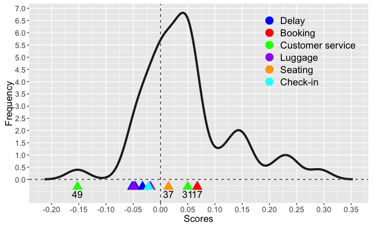
We can observe that:
- The mode of the distribution is to the right of zero and the distribution itself is skewed (i.e. it has a fatter tail) towards the right: this indicate that most topics have a positive connotation.
- Amongs the ten topics I have chosen, there is only one topic which is really negative: topic 49. This is a topic associated to (bad) customer service. Note that there is also topic 39, which has a positive connotation, i.e. it refers to good customer service. However, it is not as extreme as the negative one. This perhaps indicates that people are more restrained when it comes to praising good customer service.
- There is a bunch of topics which are "mildly" negative. These are associated to luggage, delay and checking-in. No surprises there.
- Topic 17 (Booking) is the most positive topic. While it may well be the case that customer expressed their joy at having booked a flight, this is probably the topic of choice for the airlines' marketing tweets advertising their flights and encouraging potential customers to book soon.
Topic allocations
After scoring the topics, I allocated tweets to specific topics. Generally, in topic modelling, each document (in this case) a tweet, can be expressed as a "blend" of various topics. To simplify things, for each tweet I picked the topic that represented it the most.
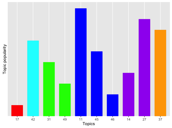
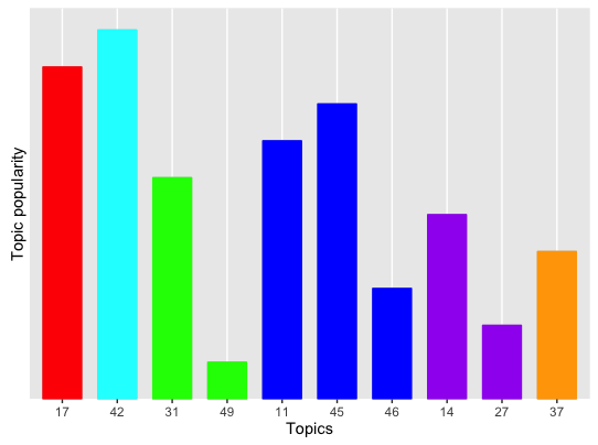
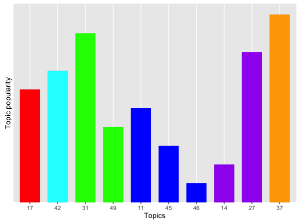
The five charts below show, for each airline, the popularity of each topic in terms of the allocation of its tweets to them. The more tweets allocated to a topic, the higher the bar corresponding to that topic.
We can immediately see some differences between the airlines. (Click on each chart to enlarge.) Note that the scores are normalised by the total number of tweets for each airline, to facilitate comparisons, as some airlines attract more tweets than others.
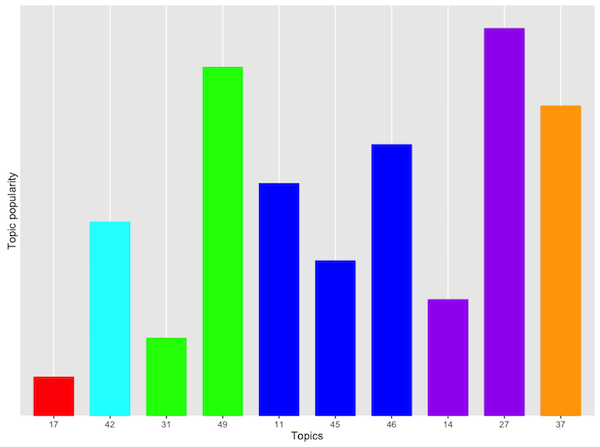
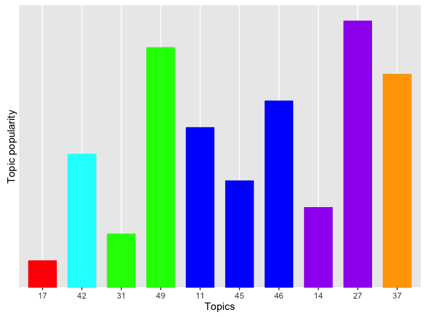
First, let's consider topic 49. Recall that this is about bad customer service. The first two airlines score pretty high here. These are, respectively, a national carrier and an orange no-frills airline. Interestingly, the airline with the lower score is a another famous no-frills airline, this time blue.
Let's now look at the most positive topic: Topic 17 (Booking). The same blue no-frills airline scores pretty high here. This reinforces my gut feeling that these tweets are probably promotional tweets by the airline itself.
The blue and purple topics are generally negative, and, perhaps not unexpectedly, they are popular across all airlines. They are less so for the fifth airline, which is a Spanish no-frills carrier. While this may be due to the fact that this airline offers a better service, my personal experience tells me that there must be some other reason. Most likely this result is due to the fact that many of the tweets mentioning this airline are in Spanish, and I have only considered English tweets. Thus, I might have missed out a lot of praise or a lot of complaints. We will never know.
Finally, Topic 37 is about seating. It's a "positive" topic (albeit only just). Airline 4 (the blue no-frills one) scores poorly here. This is not a surprise.
Topic ownership
To conclude, I've looked at the allocation of topics to the 5 airlines I considered. The chart below shows the "topic ownership" for each topic. In this case, the counts are normalised be the total number of tweets allocated to each topic.
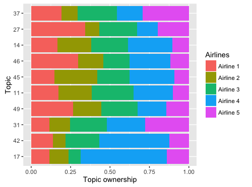
As seen above, Topic 17 (the most positive of all) is "owned" by airline 4 (those promotional tweets!). And so is topic 42, about checking in.
We can also see that topic 49, the most negative one (bad customer service) is almost shared equally amongst all airlines. It would seem, that airlines still have some work to do to differentiate themselves. I am sure that each of these negative tweets was caused by circumstances outside the airlines' control.
Closing remarks
This was just a simple analysis of airlines' tweets to check whether my subjective impressions of the different airlines I regularly use could be confirmed or dispelled. I must say that in general I was not surprised, but I think I will give the blue no-frills airline another go.
This was a starting point. A more rigorous analysis would require a much larger corpus of tweets. The topic model should also be optimised. It's an interesting, albeit longer exercise. And I have a flight to catch!
I'm a Data Scientist at Schibsted. All views reported on this site are exclusively mine and do not in any way reflect those of my employer.
Find out more about me on my homepage or